THE DAILY ILLINI
During my junior and senior years at the University of Illinois, I served as the Design Editor for The Daily Illini, a student run newspaper publication located on campus. With the assistance of my design department, my role was to add to the visual aesthetic to our publications, and assisting with a rebranding process to our print editions from a traditional broadsheet style to a more appealing tabloid style, which took place in fall of 2021. To learn more about the publication, visit the website as well as the digital collection of the printed tabloids. Visit my staff profile to see more of my work for the publication.
THE DI REBRANDING

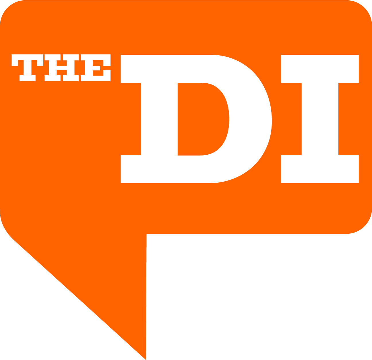
Final rendition of The DI Logo. The color of the logo is typically orange but is able to adapt to the color scheme of certain colors and themes each week.
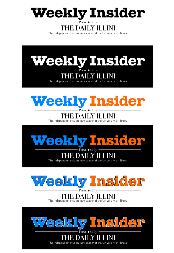
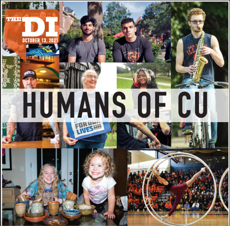
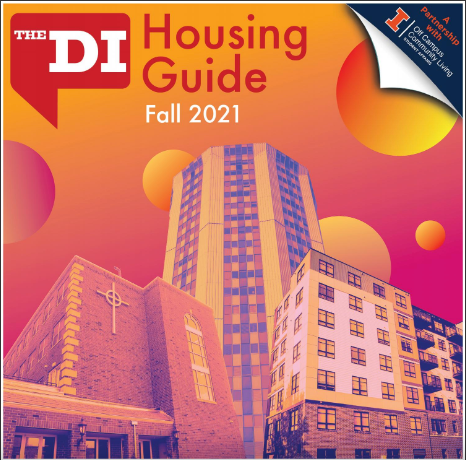
In Fall 2021, The Daily Illini underwent a rebranding process of their print product in hopes to generate more revenue. This process involved the replacement of the standard newspaper broadsheet in exchange for a more student-friendly tabloid style which would feature a particular theme each week, complimented by a creative cover to reflect each theme. With this new style of the printed paper, a new logo was needed. Abovee you will see the process I took of creating different renditions for the logo along with the final rendition coining the name for the print publication, The DI.
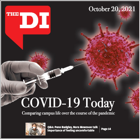
TABLOID COVERS

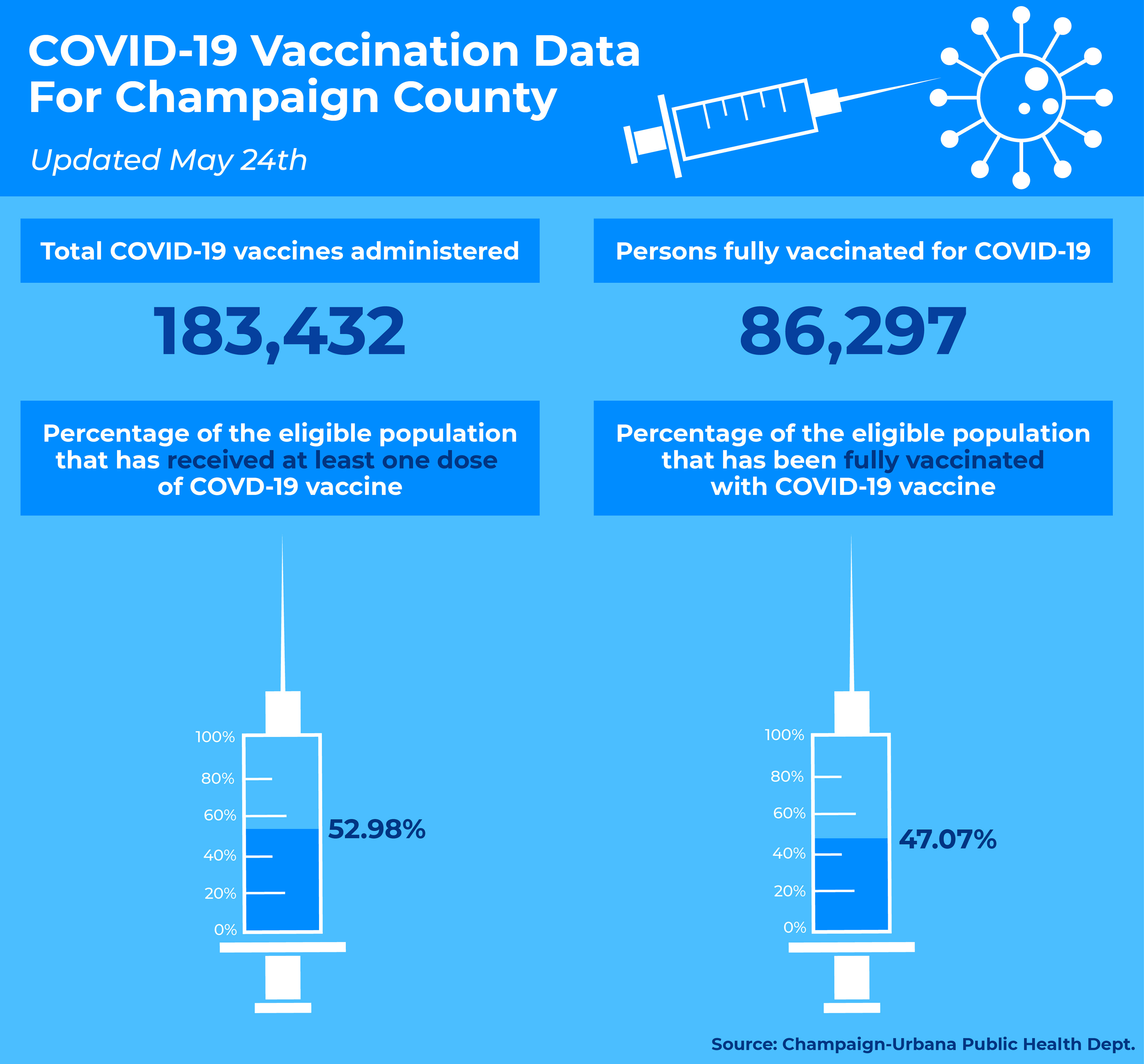
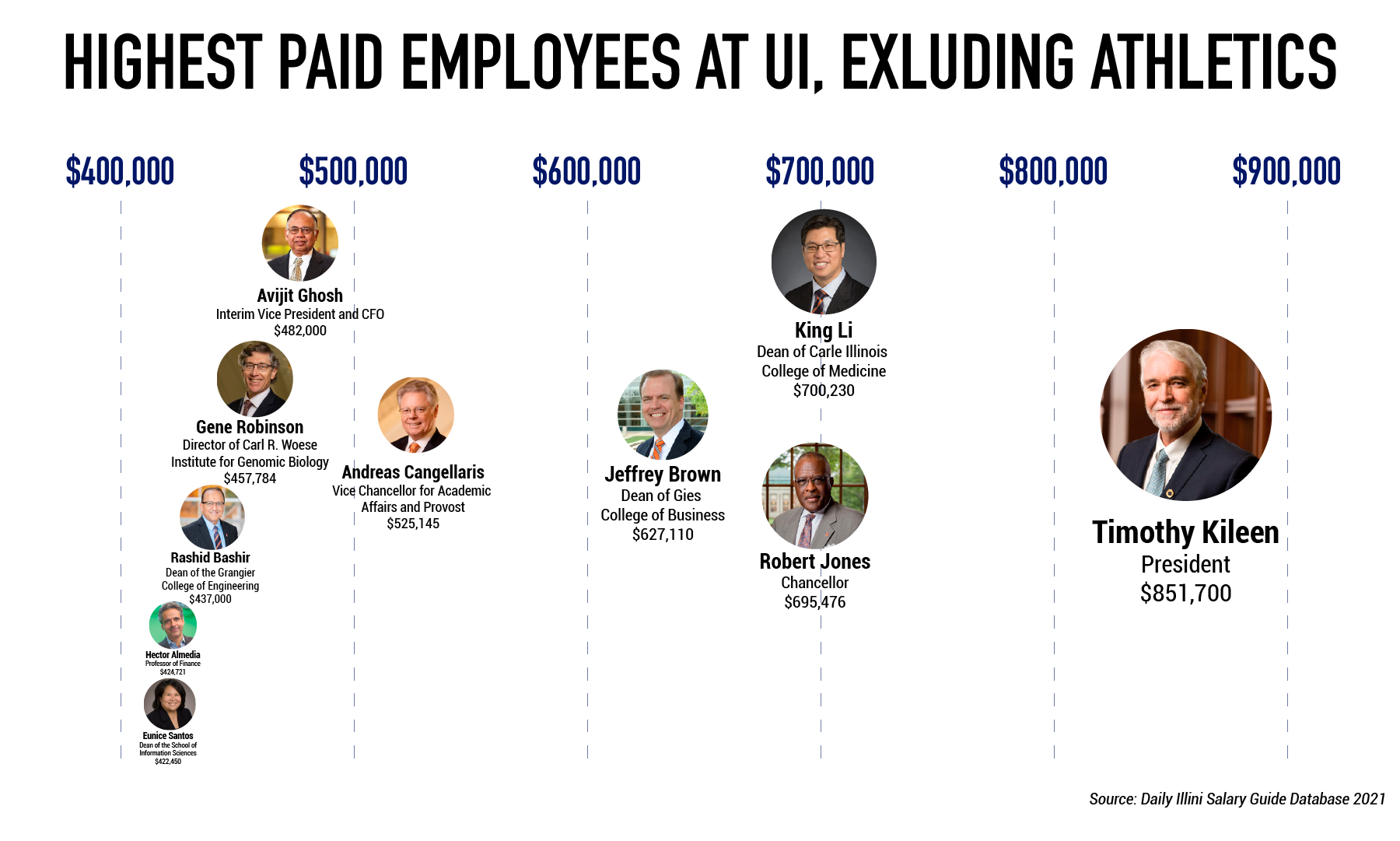
INFOGRAPHICS


ILLUSTRATIONS